
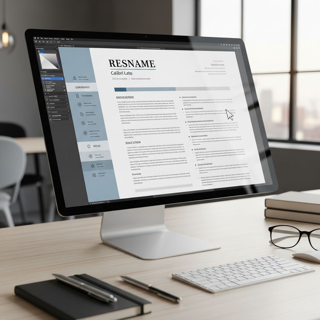
A strong resume today must do two jobs at once: it has to be instantly scannable for humans and machine-readable for applicant tracking systems (ATS). The way your resume looks on the page strongly affects both. This guide explains, in practical detail, what a modern resume should look like and how to design one that stands out for the right reasons.
1. The Overall Look: Clean, Focused, Easy to Scan
Recruiters spend only seconds on an initial scan, so the visual impression of your resume matters as much as the words on it. The goal is a minimal, structured layout that guides the eye naturally.
Key characteristics of a modern resume
- Single-page for most professionals; two pages only if you have extensive experience and relevant content.
- Generous white space between sections and lines so the page never looks crowded.
- Consistent alignment (typically left-aligned text with clear section headings).
- No dense paragraphs; short blocks of text and bullet points instead.
- Neutral color palette (black or dark gray text, optional accent color used sparingly).
Career centers at leading universities emphasize that resumes should be simple, consistent in formatting, and easy to skim quickly.
Recommended basic layout
- Top area: Name and contact details (no more than 2–3 lines).
- Upper third: Professional headline and summary or objective.
- Center of page: Work experience in reverse-chronological order.
- Lower section: Skills, education, certifications, and optional extras (projects, awards, publications).
2. Essential Sections and Their Ideal Order
While every resume is unique, most modern resumes follow a predictable structure that hiring managers expect. That familiarity helps them find what they need in seconds.
Standard section order
- Contact Information
- Professional Headline & Summary (or Objective for entry-level)
- Work Experience
- Skills
- Education
- Optional Sections (projects, certifications, languages, awards, volunteer work)
| Section | Is it required? | Where it should appear |
|---|---|---|
| Contact Information | Yes | At the very top |
| Headline & Summary | Strongly recommended | Just under contact info |
| Work Experience | Yes (if not a student) | Core middle section |
| Skills | Yes | Below or next to experience |
| Education | Yes | Below experience or above for students |
| Optional Extras | Optional | Bottom third of page |
3. Contact Details: Professional and Compact
The contact section should be extremely concise yet complete. Research on resume screening indicates that clear, accurate contact information is critical for follow-up and scheduling.
What to include
- Full name (larger font than the rest of the text).
- Professional headline (e.g., “Senior Data Analyst” or “Entry-Level Software Engineer”).
- Phone number with country/area code.
- Professional email address that uses your name (avoid nicknames).
- Location (city and state/region; full address is usually optional).
- Relevant URLs such as LinkedIn, portfolio, or personal website.
What to avoid
- Photos or headshots, unless common in your country/industry.
- Unprofessional emails (e.g., casual nicknames or random numbers).
- Multiple phone numbers or cluttered contact lines.
4. Headline and Summary: Your Snapshot at a Glance
Modern resumes usually include a brief headline and a short summary paragraph tailored to the target role. This is often the first text hiring managers read, so it must be targeted and concise.
Best practices for a strong summary
- Length: 3–4 lines of tight, achievement-focused writing.
- Content: years of experience, core specialties, and 2–3 key strengths.
- Focus: emphasize measurable impact and relevant industry context.
- Voice: implied first person (no “I”), present tense, confident wording.
For students or career changers, a short, targeted objective stating your desired role and how you can contribute may be more appropriate.
5. Work Experience: Results, Not Responsibilities
Hiring teams consistently report that achievement-focused bullet points are one of the clearest indicators of a strong resume. Listing duties alone is no longer enough.
How to structure each role
- Job title
- Company name, location
- Dates of employment (month and year are standard)
- 2–6 bullet points highlighting achievements and key responsibilities
Guidelines for effective bullet points
- Start with a strong action verb (e.g., “led”, “developed”, “increased”).
- Include specific metrics whenever possible (percentages, amounts, time saved).
- Show context + action + outcome in each bullet.
- Tailor content to match the keywords and skills in the job description.
- Keep each bullet to 1–2 lines to maintain readability.
Research into effective hiring practices shows that quantifying achievements makes it much easier for employers to compare candidates and predict future performance.
6. Skills Section: Targeted, Organized, and ATS-Friendly
Modern resumes typically have a dedicated skills block where you showcase both technical and interpersonal strengths. This section is crucial for ATS scanning because many systems search for specific skill keywords.
How to present your skills
- Use a simple list or columns instead of complex charts or graphics.
- Group related skills (e.g., “Programming”, “Data Tools”, “Languages”).
- Include only skills you can confidently demonstrate in an interview.
- Prioritize skills mentioned in the job description, stated using the same or similar wording.
Avoid rating skills with icons or bars; they do not help ATS parsing and can be subjective.
7. Education and Certifications: Clear, Honest, and Concise
The education section should be straightforward and fact-based. For early-career candidates, this may appear near the top; for experienced professionals, it usually moves below work experience.
Education formatting
- Institution name, city, and country/region.
- Degree and major/minor.
- Graduation date or expected graduation.
- Optional: GPA (if strong and appropriate), honors, key coursework, thesis or capstone topics.
Certifications and licenses
- Include only current and relevant credentials.
- List certification name, issuing organization, and year obtained.
- Renew or remove expired certifications if they are no longer valid.
8. Formatting Rules That Define a Modern Resume
Beyond what you say, how you format your resume strongly influences both readability and ATS performance.
Typography and spacing
- Use a professional, easy-to-read font (e.g., Calibri, Arial, Helvetica, Garamond).
- Font size: 11–12 pt for body text; 14–16 pt for headings.
- Line spacing around 1.0–1.15 to balance text and white space.
- Margins around 1 inch on all sides (you can tighten slightly if needed).
Consistency and hierarchy
- Use the same formatting style for all section headers.
- Align dates, job titles, and locations in a consistent pattern.
- Apply bold and italics sparingly to highlight role titles and important achievements.
Harvard’s career guidance emphasizes that consistent formatting, spacing, and typography make a resume substantially easier to read and more professional in appearance.
9. ATS Compatibility: Design That Software Can Read
Many organizations now use applicant tracking systems to screen resumes before a human sees them. If the resume layout is too complex or missing key terms, qualified candidates may be filtered out prematurely.
Design choices that help ATS
- Use standard section headings like “Work Experience” and “Skills” so software can recognize them.
- Avoid text inside images, charts, or non-standard text boxes.
- Stick to simple bullet symbols (• or -) instead of elaborate icons.
- Save and submit in PDF or DOCX format as requested in the job posting.
Keyword strategy
- Analyze the job description to identify recurring keywords and phrases.
- Use those words naturally in your summary, skills, and experience sections.
- Avoid keyword stuffing; prioritize clarity and accuracy.
10. Visual Enhancements: Subtle, Not Distracting
Visual polish can improve readability and branding when done with restraint. However, excessive graphics, multiple colors, or unconventional layouts may confuse both ATS and recruiters.
Acceptable modern design touches
- One accent color for headings or small visual elements.
- Thin dividing lines or extra spacing to separate sections.
- A modest sidebar on desktop resumes, as long as text remains selectable.
Design elements to avoid
- Heavy graphics, charts, or infographics inside the main resume file.
- Multiple fonts or loud colors that reduce legibility.
- Background images or patterns behind text.
For creative fields, consider keeping the core resume simple and linking to a portfolio where you can showcase visual work more freely.
11. Optional Sections that Strengthen a Modern Resume
Once the core sections are in place, you can add optional content that supports your story and aligns with the target role.
Effective optional sections
- Projects: Ideal for students, career changers, or technical roles; highlight your role, tools used, and measurable outcomes.
- Publications & presentations: Useful in research-heavy, academic, or thought-leadership positions.
- Awards & honors: Scholarships, performance awards, or recognition that supports your credibility.
- Languages: Especially valuable in multinational or client-facing roles.
- Volunteer work: Demonstrates initiative and transferable skills.
12. Common Visual and Structural Mistakes to Avoid
Even strong candidates undermine themselves with avoidable formatting issues. Career guidance resources consistently point to the following as frequent problems.
- Overcrowded pages with minimal margins and tiny fonts.
- Inconsistent formatting for dates, titles, and headings.
- Long paragraphs instead of concise bullet points.
- Typos and grammatical errors that signal carelessness.
- Irrelevant details (e.g., age, full mailing address, unrelated hobbies).
Proofreading carefully and asking a trusted peer or mentor to review your resume against a checklist can dramatically improve the final impression.
Frequently Asked Questions (FAQs)
Q1: How long should my resume be?
Most candidates should aim for a one-page resume, especially if they have fewer than 10–12 years of experience. A two-page resume can be appropriate for senior professionals with a long, relevant track record.
Q2: Do I need a different resume for every job?
You should maintain a core master resume, but tailor each version to the specific role by adjusting the summary, skills, and selected achievements to match the job description.
Q3: Should I use a creative template with graphics?
For most roles, a simple, professional layout works best. Highly creative templates risk confusing ATS and can distract from your content; instead, link to an online portfolio to showcase visual work.
Q4: Is a PDF or Word document better?
Follow the instructions in the job posting. When not specified, a PDF usually preserves formatting better, while some older ATS tools may handle DOCX more reliably.
Q5: How often should I update my resume?
Update your resume whenever you complete a major project, gain a certification, or change roles. At a minimum, review it every few months so it is always ready for new opportunities.
References
- Current Resume Trends for 2025 — ResumeBuilder.com. 2025-01-10. https://www.resumebuilder.com/career-center/resume-trends/
- 5 Resume Formats That Will Dominate 2025 (And 3 That Are Now Obsolete) — The Interview Guys. 2024-11-05. https://blog.theinterviewguys.com/5-resume-formats-that-will-dominate/
- The Best Resume Format for 2025 (Templates & Examples) — ResumeGenius. 2025-02-01. https://resumegenius.com/blog/resume-help/resume-format
- How to Make a Resume in 2025 | Beginner’s Guide — Novorésumé. 2025-01-15. https://novoresume.com/career-blog/how-to-write-a-resume-guide
- Create a Strong Resume — Harvard University, Mignone Center for Career Success. 2023-08-21. https://careerservices.fas.harvard.edu/resources/create-a-strong-resume/
- 16 Top Resume Tips to Help You Land a Job in 2026 — Coursera. 2024-06-12. https://www.coursera.org/articles/resume-tips

Medha Deb is an editor with a master's degree in Applied Linguistics from the University of Hyderabad. She believes that her qualification has helped her develop a deep understanding of language and its application in various contexts. Medha specializes in the areas of beauty, health, sports, and wellness and is committed to ensuring that the content on the website is…