
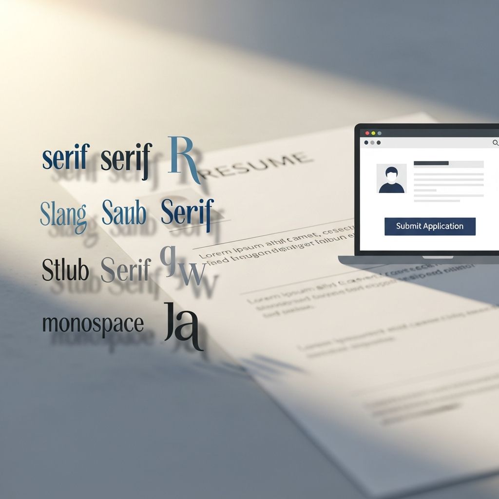
Your resume font is one of the smallest design choices you make, but it has some of the biggest impact on whether recruiters can quickly read, understand, and trust your application. The right typeface supports your content; the wrong one distracts, exhausts, or even breaks in applicant tracking systems (ATS).
This guide explains how to choose professional, ATS-safe fonts, sizes, and spacing so your resume looks sharp on any screen and in print, no matter what role or industry you are targeting.
Why Your Resume Font Matters More Than You Think
Recruiters typically scan resumes for only a few seconds before deciding whether to keep reading. A clean, legible font makes those seconds count by helping them identify your name, role, and key qualifications at a glance.
- Readability: Clear letterforms reduce eye strain and make it easier to skim your experience and skills.
- Professional tone: Conservative, well-known fonts signal that you understand workplace norms and respect the hiring process.
- ATS compatibility: Many employers use ATS software that may misread complex or decorative fonts, turning text into symbols or blank boxes.
- Cross-platform consistency: Standard system fonts display reliably on most devices and PDF viewers, preserving your layout.
Your goal is not to show off typographic creativity. It is to remove every possible obstacle between your qualifications and the person deciding whether to interview you.
Understanding Font Types: Serif vs. Sans Serif
The first major decision you make is between serif and sans-serif fonts. Both can work well on a resume if chosen and used thoughtfully.
Serif Fonts
Serif fonts have small strokes or “tails” at the ends of letters (think Times New Roman or Georgia). They are often perceived as more traditional and formal.
- Perception: Serious, established, and trustworthy—suitable for fields like law, academia, and finance.
- Strengths: Very readable in print and on high-resolution screens; convey a classic look.
- Examples: Times New Roman, Georgia, Cambria, Garamond.
Sans-Serif Fonts
Sans-serif fonts lack those extra strokes, which gives them a cleaner, more modern appearance (for example, Arial or Calibri).
- Perception: Modern, minimal, and straightforward—popular in business, tech, marketing, and startups.
- Strengths: Highly legible on screens and at small sizes; often the safest choice for digital resumes.
- Examples: Arial, Calibri, Helvetica, Verdana, Tahoma.
Most candidates can safely choose a sans-serif font for the main text and, if desired, pair it with a serif font for headings to create contrast.
Top Resume Fonts Recruiters See Every Day
While there is no single “perfect” font, some typefaces have become widely accepted standards because they are readable, professional, and available on most systems.
| Font | Type | Best For | Why It Works |
|---|---|---|---|
| Calibri | Sans-serif | Business, tech, corporate roles | Modern default font in many office suites; highly legible on screen and in print. |
| Arial | Sans-serif | General office, administration | Simple, neutral, and ATS-friendly; familiar to almost every recruiter. |
| Helvetica | Sans-serif | Design-conscious corporate roles | Crisp, balanced letterforms that look professional at various sizes. |
| Georgia | Serif | Writing, communications, hybrid roles | Designed for screen reading; classic yet not as overused as Times New Roman. |
| Times New Roman | Serif | Law, academia, traditional sectors | Highly recognizable and conservative; fits very formal industries. |
| Cambria | Serif | Corporate, research, technical roles | Designed for on-screen reading and good at small sizes; works well in dense text. |
| Verdana | Sans-serif | Engineering, IT, data roles | Wide letterforms and generous spacing improve legibility on screens. |
You do not have to use these exact fonts, but choosing something similar in tone and clarity helps ensure that your resume appears professional anywhere it is opened.
Font Size, Line Spacing, and Hierarchy
Once you have chosen a font, the next step is to size and space it so your content is easy to scan while still fitting on one or two pages.
Recommended Font Sizes
- Body text: 10.5–12 pt is usually ideal, depending on font. Sans-serif fonts often look comfortable at 11 pt; some serifs may need 11.5–12 pt.
- Section headings: Around 13–16 pt, bolded to stand out from body text.
- Name at the top: Approximately 18–24 pt, depending on layout and available space.
Beware of shrinking fonts below 10 pt just to squeeze more information onto the page. Oversized text can also look unprofessional and waste valuable space. The right size is the smallest one you can use while still reading comfortably on a laptop screen without zoom.
Line Spacing (Leading)
Line spacing strongly affects readability, especially when a resume is text-heavy.
- Single spacing: Acceptable if your font is highly legible and paragraphs are short.
- 1.15–1.2 spacing: Often the sweet spot—breathable without feeling loose.
- Extra spacing between sections: Add a bit more white space before a new section heading to guide the reader’s eye.
Think of white space as part of your design. Crowded pages suggest disorganization; airy layouts look more thoughtful and easier to skim.
Matching Font Choices to Your Industry
Although clarity is universal, font style can subtly reinforce the norms and expectations of your target field.
Conservative and Regulated Industries
Fields such as law, finance, public administration, and some corporate roles typically favor traditional typography.
- Good options: Times New Roman, Cambria, Georgia, Garamond.
- Overall feel: Serious, reliable, and formal.
- Tip: Keep bolding, italics, and color use minimal; let the content speak.
Business, Technology, and Operations
Modern organizations often use clean sans-serif fonts in their interfaces, branding, and documentation.
- Good options: Calibri, Arial, Helvetica, Tahoma, Verdana.
- Overall feel: Efficient, up-to-date, and straightforward.
- Tip: Use bold text and slight size increases, rather than decorative fonts, to create emphasis.
Creative and Communication Roles
Design, marketing, and media positions allow a bit more personality, but legibility still comes first.
- Conservative creative choice: Georgia or Garamond for a literary or editorial feel.
- Modern creative choice: A clean sans-serif like Calibri, Helvetica, or an equally readable alternative.
- Tip: If you experiment with a more distinctive typeface, test it by exporting to PDF and viewing it on multiple devices.
ATS-Friendly Font Practices
Applicant Tracking Systems parse resumes to extract names, roles, dates, and keywords. While most modern ATS software can handle standard fonts, unusual choices increase the risk of misinterpretation.
To stay ATS-friendly, follow these font and formatting rules:
- Use common system fonts: Arial, Calibri, Times New Roman, Georgia, Cambria, Verdana, and similar faces are safe choices.
- Avoid decorative scripts or novelty fonts: These can turn into unreadable characters or be flagged as graphics.
- Do not embed text inside images: ATS software usually cannot read text that has been converted to graphics.
- Limit special symbols: Standard bullet points (•) are fine; complex icons may not parse correctly.
- Save as a text-based PDF or DOCX: Both formats typically preserve fonts while remaining machine-readable.
Formatting Techniques That Enhance Your Font
Your typeface choice is only one part of your overall visual hierarchy. Use spacing, alignment, and simple emphasis to make your resume easy to navigate.
Simple Ways to Improve Legibility
- Consistent alignment: Left-align body text and dates for predictable reading patterns.
- Moderate line length: Aim for roughly 50–75 characters per line; very long lines are harder to follow.
- Use bold for emphasis: Highlight job titles, company names, and section headings; avoid underlining large blocks of text.
- Resist excessive italics or CAPITALS: These reduce readability when overused.
- Color use: If you add color, keep it dark and subtle (e.g., dark blue for headings) to preserve contrast when printed in grayscale.
Common Font Mistakes to Avoid
Even strong content can be overshadowed by distracting typography. Avoid these common pitfalls:
- Using more than two fonts: One for body text and optionally one for headings is usually enough.
- Overly playful fonts: Typefaces like Comic-style scripts, handwriting fonts, or themed novelty fonts look unprofessional in most contexts.
- Inconsistent sizing: Randomly changing font sizes within the same section undermines structure.
- Very light or thin weights: Thin variants can become nearly invisible on some screens or when printed.
- Tight line spacing: Crowding multiple lines together makes skimming difficult and tiring.
Quick Checklist Before You Send Your Resume
Use this final checklist to confirm that your resume font choices support your message instead of distracting from it:
- Is the main font a standard, professional serif or sans-serif typeface?
- Does body text sit comfortably between 10.5–12 pt?
- Are headings clearly differentiated by size or weight, not by gimmicky fonts?
- Is the layout readable on a laptop without zooming?
- Does the PDF version display correctly on multiple devices?
- Would this font look appropriate if printed in black and white?
Frequently Asked Questions (FAQs)
Q: What is the single best font for a resume?
A: There is no universal “best” font, but widely used options such as Calibri, Arial, Georgia, or Times New Roman are safe for most roles because they balance professionalism and readability while working well with ATS software.
Q: Can I use two different fonts on my resume?
A: Yes, you can pair one font for headings and another for body text, as long as both are professional and easy to read. For example, you might use a serif font for headings and a sans-serif font for bullet points. Keep pairings simple and consistent across the document.
Q: Is 10 pt too small for resume text?
A: In most cases, yes. Many recruiters view resumes quickly on screens, and very small fonts can strain the eyes. Aim for at least 10.5–11 pt for sans-serif fonts and slightly larger for some serif fonts so that your text remains comfortable to read.
Q: Do I need to match my resume font to my cover letter?
A: Using the same font family and similar formatting on both documents creates a cohesive, polished application. You can slightly adjust sizes (for example, a bit more line spacing in the cover letter) while keeping the typography consistent.
Q: How can I tell if my font is ATS-friendly?
A: A good test is to stick to widely available system fonts and then upload your resume to a major job platform to see how it parses. If core details like your name, job titles, and dates appear correctly in the preview, your font and formatting are likely compatible.
References
- Best Font for a Resume: How To Choose Type and Size — Indeed Editorial Team. 2023-08-18. https://www.indeed.com/career-advice/resumes-cover-letters/best-fonts-for-resume
- The Best Resume Fonts for 2025 (Examples & Tips) — MyPerfectResume Career Center. 2024-01-05. https://www.myperfectresume.com/career-center/resumes/how-to/best-font-for-resume
- The Top 10 Best Fonts for Your Resume in 2025 — Jobscan. 2024-02-12. https://www.jobscan.co/blog/best-fonts-resume-ats-recruiter/
- The best resume fonts, sizes, and formatting tips (2025) — Microsoft Word Cloud Blog. 2025-01-10. https://word.cloud.microsoft/create/en/blog/best-resume-fonts/
- 20 of the Best & Worst Fonts for Your Resume — Canva Design School. 2022-06-15. https://www.canva.com/learn/resume-fonts/

- Integrated M.A. in Applied Linguistics, University of Hyderabad
- 5+ years in editorial, instructional, SEO, and research-based writing
Sneha is a relationships and lifestyle writer with a strong foundation in applied linguistics and certified training in relationship coaching. She brings over five years of writing experience to theskillvault, crafting thoughtful, research-driven content that empowers readers to build healthier relationships, boost emotional well-being, and embrace holistic living. Her writing and insights reflect the belief that beauty, happiness, and wellness…