
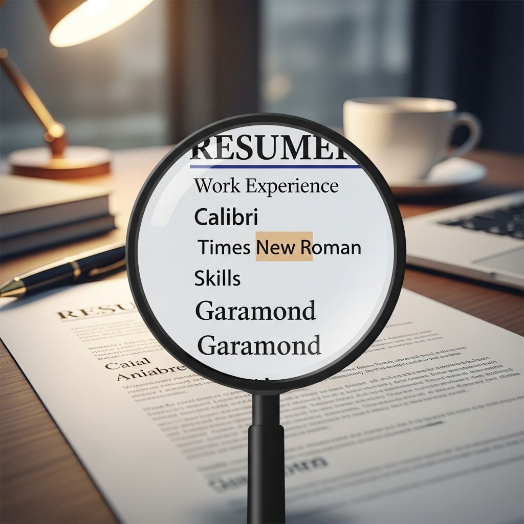
Long before a recruiter reads your most impressive achievement, they notice how your resume looks. Font choice, size, and formatting silently shape that first impression and influence whether your document feels polished, trustworthy, and worth reading in detail.
This guide explains why typography matters on a resume, which choices help (or hurt) you, and how to select a font strategy that works for both human reviewers and applicant tracking systems (ATS).
Why Font Choice Affects Your Job Search
On average, recruiters scan a resume for just a few seconds before deciding whether to keep reading. In that short window, visual clarity can make the difference between a quick skim and a fast rejection.
- Readability: Clear, familiar fonts reduce eye strain and let reviewers process information quickly.
- Professional signal: Conservative, well-spaced fonts communicate seriousness and attention to detail.
- ATS compatibility: Standard fonts are easier for automated systems to parse correctly, preventing errors in how your information is read and ranked.
Research on resume appearance shows that even basic visual changes like font size can influence how positively a resume is rated and whether it seems worthy of further consideration.
Serif vs Sans Serif: Which Style Works Better?
Most resume fonts fall into two categories: serif (with small strokes on letter ends) and sans serif (without those strokes).
| Font Type | Common Examples | Perception on a Resume | Best For |
|---|---|---|---|
| Serif | Times New Roman, Georgia, Cambria | Traditional, formal, academic, established | Law, finance, government, academia |
| Sans serif | Arial, Calibri, Helvetica | Modern, clean, straightforward | Tech, marketing, startups, design-adjacent roles |
Studies and employer surveys consistently rank fonts such as Times New Roman, Arial, and Helvetica among the safest choices because they are highly readable and widely recognized as professional.
How to Choose Between Serif and Sans Serif
- Match industry tone: Use serif fonts for conservative fields and sans serif fonts for modern or creative sectors, unless job postings show a clear preference.
- Prioritize clarity: If you are unsure, a simple sans serif like Arial or Calibri is almost always acceptable and ATS-friendly.
- Test on screen and print: Open your resume on different devices and print one page to confirm legibility at a quick glance.
Finding the Right Font Size for Each Section
The same font can look professional or cramped depending on size. Research on resume appearance suggests that slightly larger, more readable type is generally perceived more positively than small, crowded text.
Career and HR guidance commonly recommends these ranges for resumes:
- Body text: 10–12 pt
- Section headings: 12–16 pt
- Your name: 16–20 pt
Fonts smaller than about 10 pt can cause eye strain and make your resume feel dense, while very large body text can look like you are stretching limited experience to fill space.
Practical Sizing Tips
- Start with 11 pt for body text and adjust up or down only if space or readability demands it.
- Keep sizes consistent across similar elements (all bullet points the same, all headings in the same size range).
- If you are running out of space, revise content before shrinking the font below 10 pt.
Font Consistency and Hierarchy
Beyond the specific font you choose, how you apply it across the page determines how easily a reader can follow your story.
Keep It Simple
- Limit fonts: Use one font throughout, or at most one for headings and one for body text, to avoid visual clutter.
- Use styles sparingly: Bold, italics, and small caps should highlight structure (headings, company names), not decorate every line.
- Align consistently: If dates are right-aligned in one section, they should be aligned the same way everywhere.
Creating a Clear Visual Hierarchy
A good hierarchy guides the eye from most important information to details. You can create this without unusual fonts:
- Make your name the largest text on the page.
- Use slightly larger, bold text for section headings like “Experience” or “Education.”
- Keep job titles bold and on one line; company names can be regular weight on the line below or beside them.
- Add a bit of extra space above each section so divisions are obvious, even in a quick scan.
Fonts and Applicant Tracking Systems (ATS)
Many employers rely on ATS software to scan resumes before a human ever sees them. Fonts and formatting that look stylish but unconventional can confuse these systems.
ATS-Friendly Font Practices
- Choose common, system-available fonts like Arial, Calibri, Times New Roman, or Helvetica.
- Avoid decorative or script fonts that may not render correctly on all devices or within parsing tools.
- Use a standard document format (PDF or Word) as requested in the job description; some ATS parse .docx more reliably.
- Do not embed important text inside images; ATS tools may not read image-based text at all.
Common Font Mistakes That Hurt Resumes
Hiring managers frequently cite poor design and font choices as a barrier to reading resumes effectively.
- Overly small text: Shrinking everything to fit two pages makes content difficult to scan and can signal poor judgment.
- Too many styles: Combining three or four fonts, multiple colors, and frequent italics distracts from your achievements.
- Novelty fonts: Script, handwriting, or themed fonts can look unprofessional and are harder to read quickly.
- Insufficient contrast: Light gray text or colored fonts against white backgrounds reduce legibility, especially on smaller screens.
- Inconsistent spacing: Random gaps or uneven line spacing make the document feel disorganized.
Balancing Personality and Professionalism
Font choice is also a subtle way to express style, but it should never overwhelm clarity. Typography research shows that fonts can influence perceived traits such as trustworthiness, competence, and warmth.
Low-Risk Ways to Show Personality
- Choose a modern but still standard font (e.g., Calibri or Helvetica) for creative or tech roles.
- Use small touches like slightly rounded fonts or refined serif typefaces rather than ornamental scripts.
- Let the phrasing of your bullet points and accomplishments carry most of your personality, not the font itself.
Step-by-Step: Setting Up a Strong Resume Font System
If you are unsure where to start, use this simple setup as a baseline that will work for most industries.
- Pick one primary font:
- Conservative roles: Times New Roman or Cambria.
- Modern roles: Arial or Calibri.
- Set core sizes:
- Name: 18 pt, bold.
- Section headings: 13–14 pt, bold.
- Body text and bullet points: 11 pt regular.
- Define emphasis rules:
- Job titles: bold.
- Company names: regular or semi-bold.
- Locations and dates: regular, smaller emphasis, no italics needed.
- Check line spacing and margins:
- Use 1.0–1.15 line spacing for body text.
- Leave extra space before each new section so it is visually separated.
- Print and view on mobile:
- Print one page; if you cannot skim key details in a few seconds, increase size or spacing.
- Open the file on your phone to see how it appears on a smaller screen.
Sample Font Combinations for Different Situations
| Situation | Heading Font | Body Font | Notes |
|---|---|---|---|
| Traditional corporate role | Times New Roman (14 pt, bold) | Times New Roman (11 pt) | Classic and conservative; suitable for finance, legal, or government. |
| Tech or startup position | Arial (14 pt, bold) | Arial (11 pt) | Clean and modern; screens well in digital formats and ATS. |
| Academic or research CV | Cambria (14 pt, bold) | Cambria (11 pt) | Good for dense text and multi-page documents. |
| Design-adjacent role, conservative employer | Calibri (13 pt, bold) | Calibri (11 pt) | Slightly softer, modern look while remaining standard. |
Frequently Asked Questions (FAQs)
Q: Which font is safest if I can only pick one?
A: A widely used, standard font like Arial, Calibri, or Times New Roman is a safe choice for almost any role because these fonts are legible, familiar, and ATS-compatible.
Q: Is it ever OK to use two different fonts on a resume?
A: Yes, using one font for headings and another compatible font for body text can create a clear hierarchy, as long as both are standard and you apply them consistently across the document.
Q: Can I reduce font size to fit everything on one page?
A: You should revise and tighten content before shrinking the font. Avoid going below 10 pt for body text, as smaller sizes become hard to read and can lead to negative impressions of your resume.
Q: Does font choice really affect whether I get an interview?
A: Font alone will not win you a job, but research shows that visual factors like font size and layout affect how professional and appealing a resume appears, which can influence whether a recruiter chooses to read more closely.
Q: Should my cover letter use the same font as my resume?
A: Yes, using the same font family and similar sizing across your resume and cover letter creates a cohesive, polished application package.
References
- Effects of Font Size and Paper Color on Resume Review Decisions — Cheryl L. Dudik, Stephen F. Austin State University. 2009-05-08. https://laurenscharff.com/courseinfo/497studentproj/CherylDudik.pdf
- The Influence of Font Choice and Formatting on Resume Readability — MyCVCreator Blog. 2023-07-10. https://www.mycvcreator.com/blog/the-influence-of-font-choice-and-formatting-on-resume-readability
- Top Resume Fonts to Increase Your Job Application Success — Breakfast Leadership Network. 2024-01-15. https://www.breakfastleadership.com/blog/top-resume-fonts-to-increase-your-job-application-success
- Best Resume Font Size (With Templates and Examples) — Indeed Career Guide. 2023-09-20. https://au.indeed.com/career-advice/resumes-cover-letters/best-resume-font-size
- Font and Font Size Matter in Your Resume — Society for Human Resource Management (SHRM). 2018-04-19. https://www.shrm.org/topics-tools/news/career-advice-qa/font-font-size-matter-resume
- The Best Resume Fonts, Sizes, and Formatting Tips — Microsoft Word Cloud Blog. 2025-01-05. https://word.cloud.microsoft/create/en/blog/best-resume-fonts/

Medha Deb is an editor with a master's degree in Applied Linguistics from the University of Hyderabad. She believes that her qualification has helped her develop a deep understanding of language and its application in various contexts. Medha specializes in the areas of beauty, health, sports, and wellness and is committed to ensuring that the content on the website is…