
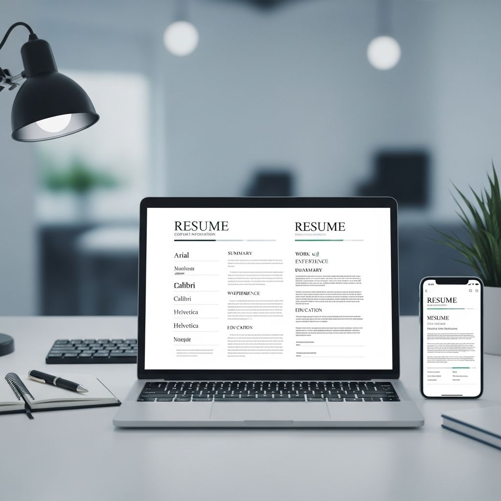
The Silent Communicator: Why Your Resume Font Matters
When you submit a resume, every element sends a message—even the font. While most job seekers focus on content, skills, and formatting, the typeface quietly shapes how hiring managers and applicant tracking systems (ATS) interpret your professionalism, attention to detail, and fit for the role. A poorly chosen font can make a strong candidate appear careless, while the right one enhances clarity, credibility, and visual appeal.
In 2025, resumes are scanned by both machines and humans, often in under 10 seconds. Your font must perform well in both contexts: it needs to be machine-readable for ATS parsing and visually digestible for recruiters. This means avoiding decorative, overly stylized, or obscure typefaces in favor of clean, widely supported fonts that prioritize legibility above all.
How Applicant Tracking Systems Read Your Resume
Most companies use applicant tracking systems to filter resumes before a human ever sees them. These systems scan documents for keywords, job titles, dates, and contact information, then rank candidates based on relevance. If your font is too unusual, too thin, or poorly rendered, the ATS may misread or even skip critical parts of your resume.
ATS software works best with standard, widely available fonts that render consistently across different operating systems and devices. Fonts like Arial, Calibri, Helvetica, and Times New Roman are reliably parsed because they are embedded in most systems and have predictable character spacing and structure. Uncommon or web-only fonts (like many Google Fonts) can cause formatting issues, especially if the recruiter opens your resume on a different device or in a different program.
To ensure ATS compatibility:
- Stick to common system fonts rather than niche or custom typefaces.
- Use standard font weights (regular, bold) instead of ultra-light or ultra-bold variants.
- Save your resume as a PDF only if the job posting allows it; otherwise, use .docx to preserve formatting.
- Avoid text inside images, tables, or text boxes, which can confuse parsing algorithms.
Serif vs. Sans-Serif: What’s the Difference?
Fonts fall into two broad categories: serif and sans-serif. Understanding the difference helps you choose a typeface that aligns with your industry and personal brand.
Serif fonts have small decorative strokes (called serifs) at the ends of letters. Examples include Times New Roman, Georgia, and Garamond. These fonts are often associated with tradition, authority, and formality. They are commonly used in law, finance, academia, and publishing, where a classic, trustworthy appearance is valued.
Sans-serif fonts lack these small strokes, giving them a cleaner, more modern look. Examples include Arial, Calibri, Helvetica, and Verdana. These are often preferred in tech, marketing, startups, and creative fields, where clarity and contemporary design matter more than tradition.
Neither category is inherently better for resumes. The key is choosing a font that is:
- Highly legible at small sizes (10–12 pt)
- Consistently rendered across devices
- Appropriate for your industry and level of experience
Top Resume Fonts for 2025 (and When to Use Them)
Not all fonts are created equal when it comes to resumes. The following typefaces are widely recommended because they combine readability, ATS compatibility, and professional appearance.
1. Calibri
Calibri has become the default choice for many professionals, especially in corporate, legal, and healthcare environments. As the standard font in Microsoft Word, it renders consistently across most systems and is highly legible at standard resume sizes. Its slightly rounded, modern sans-serif design feels approachable yet polished, making it a safe bet for most industries.
2. Arial
Arial is a classic sans-serif font known for its clean, neutral appearance. It’s widely supported, easy to read, and works well in both print and digital formats. Because it’s so common, it doesn’t draw attention to itself, which is ideal when you want the content—not the design—to stand out.
3. Helvetica
Helvetica is a timeless sans-serif font used in countless corporate logos and branding materials. Its balanced proportions and high legibility make it a strong choice for resumes in design, marketing, and tech. While not always available on every system, it’s widely supported and generally parses well in ATS.
4. Times New Roman
Times New Roman is a traditional serif font that remains a staple in many formal industries. It’s compact, allowing more text per line, which can be helpful if you’re trying to fit a lot of experience on one page. However, its ubiquity can make resumes feel generic, so it’s best used when a classic, conservative look is expected (e.g., law, government, academia).
5. Georgia
Georgia is a serif font designed specifically for on-screen readability. It has larger x-height and more open letterforms than Times New Roman, making it easier to read at smaller sizes. It’s a good choice for resumes that will be viewed primarily on screens, especially in media, publishing, and education.
6. Garamond
Garamond is a lighter, more elegant serif font that conveys sophistication. It’s thinner than Times New Roman, which can help save space without sacrificing readability. It’s particularly well-suited for roles in writing, editing, academia, and the arts, where a refined, intellectual tone is appropriate.
7. Cambria
Cambria is a serif font optimized for screen reading, with even stroke weights and clear letterforms. It’s a professional, slightly more formal alternative to Calibri and works well in fields like finance, consulting, and healthcare, where a polished, authoritative tone is important.
8. Verdana and Tahoma
Verdana and Tahoma are sans-serif fonts designed for digital legibility. They have generous spacing and large x-heights, making them easy to read on screens. Verdana is slightly wider, while Tahoma is more compact. Both are excellent choices for tech, IT, and digital-focused roles where clarity on monitors is a priority.
Fonts to Avoid on a Resume
Some fonts, while visually interesting, are inappropriate for professional resumes. These include:
- Decorative fonts: Script, handwriting, or novelty fonts (e.g., Comic Sans, Papyrus, Curlz) appear unprofessional and are often ignored by ATS.
- Overly thin or light fonts: Fonts like Helvetica Light or Arial Narrow can be hard to read, especially in print or on low-resolution screens.
- Overly bold or condensed fonts: Impact, Arial Black, and similar heavy fonts can look aggressive and clutter the page.
- Overly italicized fonts: Strongly slanted or cursive styles reduce readability and give an informal impression.
When in doubt, choose a simple, neutral font that lets your experience speak for itself.
Font Size and Hierarchy: Making Your Resume Easy to Scan
Even the best font won’t help if the sizing is off. Recruiters scan resumes quickly, so clear visual hierarchy is essential. Use size, weight, and spacing to guide the reader’s eye through your name, section headers, and bullet points.
General guidelines for resume font sizes:
| Element | Recommended Size |
|---|---|
| Your name (header) | 24–36 pt |
| Section headers (Experience, Education, Skills) | 14–16 pt |
| Body text (job descriptions, education details) | 10–12 pt |
Some fonts may need slight adjustments:
- Thinner fonts like Garamond may need to be set at 11–12 pt to remain legible.
- Bolder fonts like Arial or Calibri can often work at 10–11 pt without losing clarity.
- Always test print and view your resume on multiple devices to ensure readability.
Matching Your Font to Your Industry
Your font should subtly reflect the culture and expectations of your field. Here’s how to align your choice with common industries:
Corporate, Finance, Law, Government
- Preferred fonts: Times New Roman, Calibri, Cambria, Georgia
- Style: Conservative, professional, highly legible
- Goal: Convey reliability, precision, and attention to detail
Tech, Startups, IT, Engineering
- Preferred fonts: Calibri, Arial, Helvetica, Verdana, Tahoma
- Style: Clean, modern, minimal
- Goal: Emphasize clarity, efficiency, and technical competence
Marketing, Design, Creative Fields
- Preferred fonts: Helvetica, Georgia, Garamond, Calibri
- Style: Polished but slightly more distinctive
- Goal: Show design awareness without sacrificing professionalism
Academia, Education, Publishing
- Preferred fonts: Times New Roman, Georgia, Garamond, Cambria
- Style: Traditional, scholarly, highly readable
- Goal: Project intellectual rigor and formal expertise
Practical Tips for Font Selection and Formatting
Once you’ve chosen a font, apply it consistently and thoughtfully. Here are key best practices:
- Use one font family: Stick to a single font for the entire resume. Use bold, italics, and size variations to create hierarchy, not multiple typefaces.
- Limit font weights: Use regular and bold only. Avoid light, thin, or condensed variants, which can be hard to read.
- Left-align text: Left-aligned text is easiest to scan. Avoid justified text, which can create uneven spacing and “rivers” of white space.
- Use adequate line spacing: 1.0 to 1.15 line spacing is usually ideal. Too little spacing feels cramped; too much wastes space.
- Test across devices: Open your resume on a phone, tablet, and different computers to ensure the font renders correctly.
FAQs: Common Questions About Resume Fonts
What is the best font for a resume in 2025?
There is no single “best” font, but Calibri, Arial, Helvetica, Times New Roman, and Georgia are consistently recommended because they are legible, ATS-friendly, and widely supported. Choose one that fits your industry and personal style.
Should I use a serif or sans-serif font?
Both can work well. Serif fonts (Times New Roman, Georgia, Garamond) are traditional and formal, ideal for law, finance, and academia. Sans-serif fonts (Calibri, Arial, Helvetica) are modern and clean, often preferred in tech, marketing, and startups.
What font size should I use?
Use 10–12 pt for body text, 14–16 pt for section headers, and 24–36 pt for your name. Adjust slightly based on the font’s weight and your layout, but always prioritize readability.
Can I use Google Fonts or other web fonts?
It’s risky. Many ATS and older systems may not support web fonts, causing your resume to default to a system font and potentially breaking the layout. If you must use a web font, embed it in a PDF and test thoroughly, but system fonts are safer.
How many fonts should I use on my resume?
Stick to one font family. Use bold, italics, and size changes to create visual hierarchy. Using multiple fonts can make your resume look cluttered and unprofessional.
Are creative fonts ever acceptable?
Only in very specific cases, such as design portfolios or creative director roles, and even then, they should be used sparingly (e.g., for a stylized name or header). The body text should still be highly legible and professional.
Final Checklist: Choosing and Using Your Resume Font
Before finalizing your resume, ask yourself:
- Is the font widely supported and ATS-friendly?
- Is it easy to read at 10–12 pt on screen and in print?
- Does it match the tone of my industry?
- Is the sizing consistent and well-structured?
- Have I tested it on multiple devices and in different formats?
Remember: the goal of your resume font is not to impress with style, but to ensure your qualifications are seen, understood, and remembered. A simple, professional font that supports clear communication will always outperform a flashy but distracting one.
References
- Applicant Tracking System Standards and Best Practices — Society for Human Resource Management (SHRM). 2024. https://www.shrm.org/resourcesandtools/hr-topics/talent-acquisition/pages/applicant-tracking-systems.aspx
- Typography Guidelines for Professional Documents — Microsoft Typography. 2023. https://docs.microsoft.com/en-us/typography/
- Font Readability and Legibility in Digital and Print Media — Nielsen Norman Group. 2023. https://www.nngroup.com/articles/legibility-readability-fonts/

- Integrated M.A. in Applied Linguistics, University of Hyderabad
- 5+ years in editorial, instructional, SEO, and research-based writing
Sneha is a relationships and lifestyle writer with a strong foundation in applied linguistics and certified training in relationship coaching. She brings over five years of writing experience to theskillvault, crafting thoughtful, research-driven content that empowers readers to build healthier relationships, boost emotional well-being, and embrace holistic living. Her writing and insights reflect the belief that beauty, happiness, and wellness…