
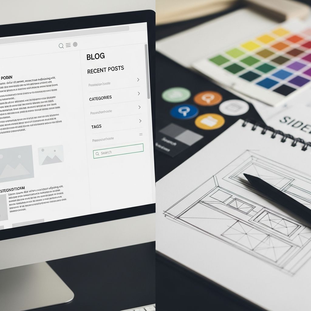
Blog sidebars serve as vital navigational and promotional hubs on websites, influencing how visitors interact with content and ultimately affecting engagement rates. Positioned alongside primary articles, these vertical panels offer opportunities to highlight key resources, capture leads, and guide user journeys without disrupting the main reading flow. When optimized correctly, sidebars can significantly boost metrics like time on site and conversion rates, making them indispensable for content creators aiming to maximize visibility.
Understanding the Role of Sidebars in Content Layouts
At their core, sidebars function as secondary content zones that complement the central blog post area. They typically appear on the right side in left-to-right reading cultures, though left-side placement works well for right-handed users or specific design aesthetics. This positioning leverages natural eye scanning patterns, where readers’ gazes often drift rightward after absorbing headlines and intros. Effective sidebars balance utility and subtlety, providing quick access to supplementary materials like archives, social proofs, or calls-to-action (CTAs) that encourage deeper exploration.
Historically, sidebars evolved from print magazine margins, where they housed ads, quotes, or fact boxes. In digital contexts, they adapt to dynamic needs, such as promoting recent posts or email subscriptions. Research from user experience studies emphasizes their role in reducing bounce rates by offering immediate value—readers who find relevant links stay longer and return more frequently.
Strategic Planning for Sidebar Effectiveness
Before adding elements, define your sidebar’s objectives. Common goals include growing subscriber lists, promoting affiliate products, or facilitating content discovery. Align every widget with these aims to avoid dilution of focus. For instance, if lead generation tops your list, prioritize opt-in forms over less critical links.
- Identify primary goals: List 2-3 key outcomes, such as email signups or social shares.
- Audience analysis: Tailor content to visitor preferences—tech blogs might feature tool roundups, while lifestyle sites highlight recipes.
- Performance tracking: Use analytics to monitor click-through rates and refine iteratively.
Content hierarchy is paramount; position high-priority items at the top where visibility peaks. Tools like heatmapping software reveal that upper sections receive 70-80% more attention, informing placement decisions.
Core Design Principles for Clean Sidebars
A cluttered sidebar repels users, so embrace minimalism. Limit widgets to 5-7 to maintain scannability. Employ generous white space—padding of 15-20px between elements enhances readability and creates a premium feel. Visual consistency with the main site’s palette, typography, and imagery fosters cohesion.
| Principle | Best Practice | Impact |
|---|---|---|
| Simplicity | Max 7 widgets | Reduces cognitive load |
| White Space | 15-20px padding | Improves focus |
| Color Harmony | Match site theme | Builds trust |
| Typography | Readable fonts, 14-16px | Enhances accessibility |
Icons and subtle animations add appeal without overwhelming. Chevron arrows for expandable sections, for example, signal interactivity intuitively.
Optimal Dimensions and Responsiveness
Ideal sidebar widths range from 240-300px on desktops, ensuring ample content display without encroaching on the main column, which should occupy 60-70% of viewport width. For collapsed states, narrow to 48-64px, showing icons only.
Responsiveness is non-negotiable in 2026’s mobile-dominated landscape. On tablets and phones, sidebars often collapse into hamburger menus or bottom sheets. Implement media queries to stack elements vertically below 768px breakpoints, preserving access to essentials like search bars. Test across devices: iOS Safari, Android Chrome, ensuring touch targets exceed 44x44px per WCAG standards.
- Desktop: Fixed 280px width
- Tablet: 200px or collapsible
- Mobile: Hidden, toggle via icon
Selecting High-Impact Sidebar Elements
Curate elements that deliver value swiftly. Top placements suit CTAs like ‘Subscribe Now’ forms with compelling incentives—e.g., free ebooks yielding 20-30% conversion uplifts.
About sections or author bios humanize the brand, featuring photos and brief credentials. Popular/recent posts widgets drive internal linking, improving SEO dwell time. Social media feeds or share buttons amplify reach, while category navigations (limited to 5-7) aid topic-based browsing.
Proven Widget Combinations
- Email opt-in + Popular posts
- Search bar + Social icons
- Categories + Instagram feed
- CTA banner + Archives (static links)
Avoid frequent rotations; static links to evergreen content maintain SEO stability.
Advanced Techniques for Enhanced UX
Implement sticky sidebars that scroll with content, keeping CTAs in view—boosting conversions by 15-25% per A/B tests. Dynamic personalization, via tools like OptinMonster, displays tailored recommendations based on user behavior.
Accessibility demands contrast ratios of 4.5:1 for text, keyboard-navigable links, and ARIA labels for screen readers. Subtle hover states (e.g., background shifts) provide feedback without distraction.
For multi-level navigation, use accordions with smooth transitions: 300ms ease-in-out animations guide eyes naturally. Context-aware designs adapt per page—e.g., related posts on articles, services on homepages.
Tools and Builders for Sidebar Creation
No-code platforms streamline design. Elementor and Beaver Builder offer drag-and-drop interfaces for widget stacking, styling, and responsiveness. SeedProd excels in landing-page style sidebars with A/B testing.
WordPress users leverage Gutenberg blocks or plugins like Widget Options for conditional logic—show sidebars only on posts, not pages. Advanced devs customize via CSS Grid: grid-template-areas: "main sidebar"; for flexible layouts.
Real-World Examples and Case Studies
Designers Oasis employs a minimalist sidebar with bold CTAs atop a clean feed, achieving high engagement. UX Planet showcases collapsible multi-panels with icons, ideal for dashboards. Grace + Vine Studios prioritizes relevant static links bottom-loaded for longevity.
Navbar Gallery highlights 2026 trends: vertical accordions with icons, responsive collapses. These exemplify scalability—expandable sections house subcategories without clutter.
Frequently Asked Questions (FAQs)
What is the ideal number of widgets for a blog sidebar?
Limit to 5-7 widgets to prevent overload, focusing on high-value items like CTAs and navigation.
Should sidebars be sticky or static?
Sticky sidebars keep elements visible during scrolls, ideal for CTAs, but test for distraction on long pages.
How do I make sidebars mobile-friendly?
Collapse into hamburger menus or bottom bars, prioritizing 3-4 key elements with large touch targets.
What’s better: left or right sidebar placement?
Right-side dominates for Western audiences due to reading flow, but left suits RTL languages or aesthetics.
Do sidebars impact SEO?
Yes, through internal links and dwell time boosts; use static, relevant anchors for crawl efficiency.
Common Mistakes and Fixes
Oversights like widget spillover scream unprofessionalism—resize images to fit. Inconsistent sidebars across pages confuse users; standardize via themes. Overloading with ads tanks engagement—cap at 20% space allocation.
Fixes: Audit quarterly, A/B test variants, solicit user feedback via polls.
References
- Blog Sidebar Design: Best Practices, Tools, and Inspiring Examples — Curator.io. 2023-05-15. https://curator.io/blog/blog-sidebar-design
- Best UX Practices for Designing a Sidebar — UX Planet (Dmitry Sergushkin). 2022-10-20. https://uxplanet.org/best-ux-practices-for-designing-a-sidebar-9174ee0ecaa2
- What to Put on Your Sidebar — Grace + Vine Studios. 2023-08-12. https://www.graceandvinestudios.com/what-to-put-on-your-sidebar/
- Eleven Tips for Creating an Engaging Blog Sidebar — Studio Mommy. 2024-02-28. https://studiomommy.com/eleven-tips-for-creating-an-engaging-blog-sidebar/
- 8+ Best Sidebar Menu Design Examples of 2026 — Navbar Gallery. 2026-01-10. https://www.navbar.gallery/blog/best-side-bar-navigation-menu-design-examples

- Integrated M.A. in Applied Linguistics, University of Hyderabad
- 5+ years in editorial, instructional, SEO, and research-based writing
Sneha is a relationships and lifestyle writer with a strong foundation in applied linguistics and certified training in relationship coaching. She brings over five years of writing experience to theskillvault, crafting thoughtful, research-driven content that empowers readers to build healthier relationships, boost emotional well-being, and embrace holistic living. Her writing and insights reflect the belief that beauty, happiness, and wellness…