
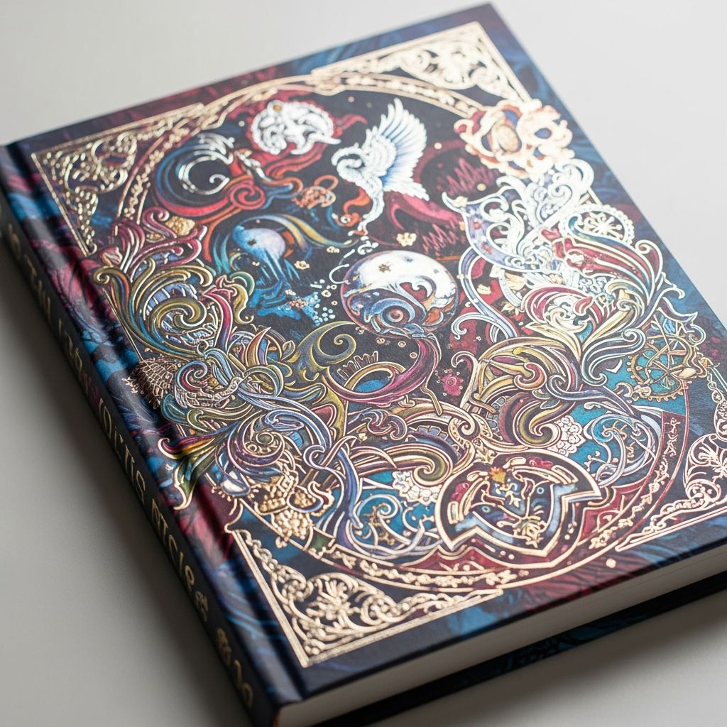
Book covers serve as the first impression for potential readers, often determining whether a title gets picked up or overlooked. In the competitive world of publishing, a well-designed cover can significantly influence sales and reader engagement. This guide explores key principles, practical steps, and best practices to help authors and designers create covers that resonate with target audiences.
Understanding the Role of Book Covers in Publishing Success
A book’s cover is more than decoration; it’s a marketing tool that communicates genre, tone, and intrigue at a glance. Studies show that covers influence up to 80% of purchasing decisions on platforms like Amazon. Effective designs align with reader expectations while standing out through unique elements.
- Genre Signaling: Readers quickly identify categories like thriller or romance via visual cues such as color schemes and imagery.
- Emotional Pull: The right imagery evokes curiosity or excitement, prompting further exploration.
- Professional Polish: High-quality execution builds credibility, especially for self-published works.
Whether for print or digital formats, covers must adapt to various sizes and platforms, from thumbnails to full displays.
Researching Your Genre for Authentic Design
Before sketching ideas, compile a “swipe file” of 10-20 bestselling covers in your subgenre. Analyze Amazon’s Top 100 lists to note common patterns in colors, fonts, layouts, and imagery. This ensures your cover fits genre conventions while offering a fresh twist.
For instance, epic fantasy often features dark blues with metallic accents, while cozy mysteries favor warm pastels and illustrative art. Aim for 70% alignment with these trends to avoid confusing browsers.
| Genre | Common Colors | Typical Imagery | Font Style |
|---|---|---|---|
| Fantasy | Deep blues, purples, golds | Dragons, landscapes, heroes | Ornate, bold serifs |
| Romance | Pinks, reds, soft gradients | Couples, florals | Elegant scripts |
| Thriller | Blacks, grays, stark contrasts | Shadows, eyes, weapons | Sans-serif, distressed |
| Mystery | Earth tones, muted hues | Clues, vintage objects | Clean, typewriter-style |
This table summarizes trends to guide your choices, ensuring market relevance.
Selecting the Perfect Focal Point
Every standout cover revolves around a single, powerful focal point that captures attention instantly. Avoid cluttered montages; one strong image or typographic element draws the eye without overwhelming.
- Choose imagery symbolizing your core theme, like a lone figure for isolation or a glowing artifact for adventure.
- Test in grayscale to confirm visibility; strong contrast ensures thumbnail effectiveness.
- Consider non-photographic options: abstract shapes or bold lettering can be equally compelling.
Layer this element over a subtle background to create depth, mimicking professional compositions.
Mastering Color Schemes and Contrast
Color psychology plays a pivotal role: blues convey trust, reds urgency, and earth tones warmth. Limit to one dominant hue plus an accent for cohesion.
High contrast between background, focal point, and text prevents readability issues, especially in small formats. Tools like Adobe Color help generate harmonious palettes matching your genre vibe.
Pro Tip: Convert your design to grayscale—if key elements pop, your contrast works across devices.
Typography Essentials for Impactful Titles
Fonts must be legible at small sizes and genre-appropriate. Pair no more than two typefaces: one for the title (bold, decorative) and one for subtitles/author (clean sans-serif).
- Establish hierarchy: Title largest, then subtitle, author smallest.
- Experiment with effects like shadows or outlines for depth on busy backgrounds.
- Reference swipe files—chunky caps for fantasy, flowing scripts for romance.
Avoid overused novelty fonts; clarity trumps trendiness.
Building Layers for Professional Depth
Great covers feature layered elements: background texture, midground focal image, foreground text. Use software like Photoshop or Canva to blend seamlessly with consistent lighting.
- Background: Gradient, texture, or washed photo for mood.
- Midground: Main visual with subtle blur if needed.
- Foreground: Text with drop shadows or glows for separation.
This technique adds dimension, making flat designs feel immersive.
Technical Specifications for Print and Digital
Match your design to format requirements. Common paperback sizes are 6×9 inches; ensure 300 DPI resolution and bleed margins.
| Format | Recommended Size (inches) | Resolution | Key Considerations |
|---|---|---|---|
| Ebook | 1600×2560 px | 300 DPI | Thumbnail optimization |
| Paperback | 6×9 or 5.5×8.5 | 300 DPI | Spine text, full wrap |
| Hardcover | 6×9 | 300 DPI | Dust jacket flaps |
Verify specs via platforms like IngramSpark or KDP.
DIY Tools and Software Options
Beginners can start with free tools like Canva for drag-and-drop templates or Adobe Express for quick customizations. Advanced users prefer Photoshop for precise control.
- Canva: Intuitive for novices, vast libraries.
- Photoshop: Layer mastery for pros.
- Pro: Affordable entry; Con: Limited customization vs. custom design.
Hybrid approach: Mockup in Canva, refine in pro software.
Hiring Professionals vs. Going Solo
DIY suits budgets under $100 but risks amateur looks. Professionals (via Reedsy or 99designs) deliver genre-savvy results for $200-1000. Weigh skills, time, and ROI.
Get feedback from genre peers before finalizing—beta readers spot mismatches.
Common Pitfalls and How to Avoid Them
Steer clear of:
- Overloading with elements—keep it simple.
- Poor legibility—test at 100px width.
- Genre mismatch—stick to swipe file cues.
- Ignoring spine/back—vital for print.
Frequently Asked Questions (FAQs)
What is the ideal book cover size?
Popular sizes include 6×9 inches for paperbacks; ebooks favor 1600×2560 pixels. Customize based on your printer’s specs.
How do I choose images for my cover?
Source royalty-free stock from Unsplash or Shutterstock, ensuring one strong focal image matches your theme.
Can I design my cover for free?
Yes, tools like Canva and Adobe Express offer free tiers with templates for professional results.
Why does genre matter in cover design?
Covers signal expectations; misalignment leads to low conversions as readers self-select by visuals.
Should I include a subtitle?
If it clarifies your hook, yes—keep it concise and hierarchical below the main title.
Final Steps to Polish and Launch
Export in required formats, A/B test thumbnails on social media, and iterate based on feedback. A refined cover can elevate your book’s market performance dramatically.
References
- How to Design a Book Cover: 10 Dos and Don’ts — Reedsy. 2023. https://reedsy.com/blog/guide/book-cover-design/how-to-design/
- How to Design a Book Cover – And Avoid Fatal Mistakes — LitReactor. 2022-10-15. https://litreactor.com/columns/how-to-design-a-book-cover
- The Ultimate Guide to Master Your Book Cover Design — IngramSpark. 2024. https://www.ingramspark.com/master-your-book-cover-design
- Create a Free Book Cover — PosterMyWall. 2024. https://www.postermywall.com/index.php/l/book-cover
- The Free Book Cover Maker With Stunning Layouts — Canva. 2024. https://www.canva.com/create/book-covers/

Medha Deb is an editor with a master's degree in Applied Linguistics from the University of Hyderabad. She believes that her qualification has helped her develop a deep understanding of language and its application in various contexts. Medha specializes in the areas of beauty, health, sports, and wellness and is committed to ensuring that the content on the website is…