
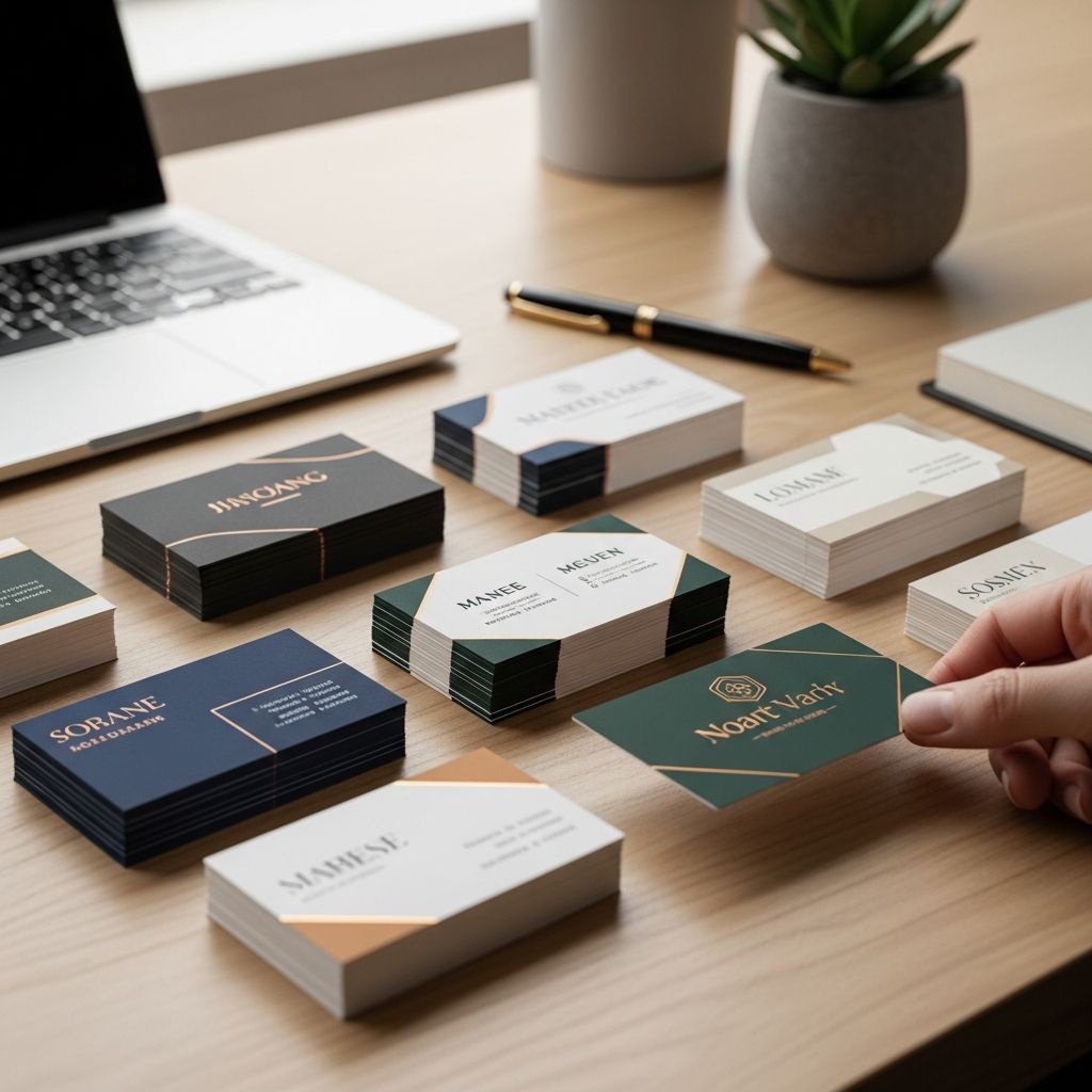
Digital profiles dominate professional life, but the simple personal business card remains one of the fastest ways to make a memorable connection. When designed thoughtfully and used strategically, it becomes a compact, tangible snapshot of who you are, what you do, and how you can be reached.
This guide explains why personal business cards still matter, how to decide if you need one, what information to include, and how to design a card that fits a modern, multi-hyphenate career.
Why Personal Business Cards Still Matter
Even in an era of smartphones and LinkedIn, professionals continue to use business cards at conferences, meetings, interviews, and informal networking events. Design and printing companies point out that cards still act as an immediate, physical reminder of your brand in situations where it is awkward or slow to exchange contact details digitally.
Key reasons they remain relevant include:
- Speed: Handing over a card is often faster than unlocking a phone, finding a profile, and sending a connection request.
- Tangibility: A physical card can sit on someone’s desk or in a wallet, keeping you top of mind after an event.
- Professionalism: A polished card signals preparation and seriousness about your work.
- Branding: The layout, typography, and color reinforce how you want to be perceived professionally.
Deciding Whether You Need a Personal Card
Not everyone needs a personal card separate from an employer’s card, but for many professionals it is useful. Consider creating your own card if any of these apply:
- You are in transition: You are job searching, between roles, or pivoting careers and want neutral, employer-independent contact details.
- You have multiple professional identities: For example, you are an analyst by day and a freelance designer or writer after hours.
- You attend a lot of events: Conferences, meetups, industry panels, or community activities where spontaneous introductions happen.
- Your company card is restrictive: It may not reflect your full skill set, personal website, or side projects.
If your field is relationship-driven (sales, consulting, creative services, entrepreneurship, academia, or nonprofit leadership), a personal card can be especially valuable.
Clarifying Your Purpose Before You Design
Before choosing fonts or paper, define what you want the card to achieve. Career and design resources consistently recommend starting with the audience and goal, then shaping content and design around that.
Ask yourself:
- Who will receive this card? Recruiters, potential clients, collaborators, or peers?
- What action do you want them to take? Visit your portfolio, email you, schedule a call, invite you to speak, or remember you for a role later?
- What should they remember first? Your name, a core skill, your title, or a specific service you offer?
Your answers will influence what information is most prominent and what can be left out.
Essential Information to Include
The most effective personal business cards share a few core elements. Design guides suggest staying focused on the details that help people contact you easily while avoiding information overload.
| Element | Purpose | Tips |
|---|---|---|
| Name | Identifies you clearly | Use the same version as on your resume and LinkedIn. |
| Professional headline | Summarizes what you do | Keep to a few words (e.g., “Product Manager | UX Research”). |
| Email address | Primary contact method | Use a professional address with your name. |
| Phone number | For time-sensitive outreach | Include if you are comfortable with direct calls or texts. |
| Web link | Shows your work or profile | Personal site, portfolio, or short LinkedIn URL. |
Optional but Powerful Additions
- City and region: Useful if your work is location-dependent (e.g., real estate, local consulting).
- Social media handles: Include only accounts that are professional and current, such as LinkedIn or a curated Instagram for creatives.
- A short positioning line: One sentence or phrase that explains how you create value, such as “Helping nonprofits communicate complex data clearly.”
- Pronouns: If you want to reduce ambiguity and model inclusive communication, you can list pronouns beneath your name.
Design Basics: Making Your Card Easy to Read
The main job of your card is not to show every skill you have; it is to be instantly legible and visually consistent with your professional brand. Design experts emphasize readability, hierarchy, and simplicity as the foundation of a good card.
Typography and Font Size
- Choose clear fonts: Sans-serif or simple serif fonts (similar to Arial or Times New Roman) are easier to read at small sizes.
- Respect size guidelines: Many designers recommend keeping important text at 8 pt or larger and your name or company name above 12 pt for legibility.
- Limit font styles: Use no more than two typefaces and avoid overly decorative scripts that reduce readability.
Layout, White Space, and Flow
- Guide the eye: People generally scan from left to right and top to bottom in English-speaking contexts, so place your name and primary role where the eye naturally lands first.
- Use white space strategically: Leaving intentional empty areas makes the card easier to read and gives recipients space to jot a note about you.
- Keep key text away from edges: Many print guides recommend maintaining a margin between text and the trim edge to avoid cutting issues and visual crowding.
Color, Contrast, and Branding
- Align with your brand: If you already use certain colors on your website or portfolio, repeat them on your card for consistency.
- Prioritize contrast: Make sure there is enough contrast between text and background for easy reading, including for people with visual impairments.
- Use color sparingly: One or two accent colors often feel more professional than a busy palette.
Choosing Format, Size, and Materials
While the traditional business card resembles the size of a credit card, there is flexibility in shape and finish. Print and design sources note that size and orientation affect how much information you can include and how the card feels in the hand.
Common Formats
- Standard horizontal: Familiar, wallet-friendly, and usually the safest choice for formal industries.
- Vertical orientation: Feels more contemporary and can emphasize a central logo or personal monogram.
- Non-standard shapes: Rounded corners or square cards can stand out but may not fit all cardholders.
Paper and Finish
- Thicker stock: A heavier card often feels more substantial and durable, contributing to a professional impression.
- Matte vs. glossy: Matte is easier to write on; glossy can enhance photography or bold colors.
- Special finishes: Foil accents, spot gloss, or textured stocks can add sophistication, but use sparingly to avoid distraction.
Aligning Your Card With Your Personal Brand
Your personal business card should feel like a physical extension of your online presence. Career resources often stress the importance of consistent branding across resumes, portfolios, and social media.
To create alignment:
- Use the same headshot or logo: If you have a logomark or personal monogram, place it prominently.
- Keep titles consistent: Match your card’s headline to the role listed on your resume and LinkedIn.
- Maintain tone: A minimalist card suits a corporate strategist; a more playful design may fit a children’s illustrator or event planner.
Using Both Sides of the Card
You are not limited to one side. Many modern cards use the back for branding or a concise message while keeping the front clean and practical.
Ideas for the back of your card include:
- Short tagline or value statement that summarizes what you do.
- A link or QR code pointing to your portfolio or booking page.
- A simple pattern or color block that reinforces your visual identity and makes the card recognizable in a stack.
Common Mistakes to Avoid
Professional printers and design educators highlight several recurring issues that reduce the impact of a business card.
- Overcrowding the card: Trying to fit a mini-resume onto a small surface makes everything harder to read.
- Low-contrast text: Light gray text on a pale background or thin fonts can disappear once printed.
- Unclear call to action: If it is not obvious how someone should follow up with you, the card may be kept but never used.
- Outdated contact details: Old email addresses, broken URLs, or job titles you no longer use can create confusion.
- Poor-quality printing: Low resolution or smudged ink undermines otherwise strong content; design references commonly recommend a print resolution around 300 dpi for crisp results.
How to Distribute and Use Your Card Strategically
Designing a strong card is only half the work; the other half is using it at the right moments. Effective networking relies on timing, relevance, and follow-through.
Situations Where a Personal Card Helps
- Networking events and conferences: Offer your card after conversation, not as the opening move.
- Informational interviews: Leave a card with your main contact channel and LinkedIn to support future referrals.
- Workshops and talks you attend: Exchange cards with speakers or attendees with whom you had meaningful discussions.
- Community involvement: Volunteer projects, local organizations, and side initiatives often lead to unexpected professional opportunities.
Follow-Up Etiquette
- Reference the interaction: When you email someone who took your card, mention where you met and what you discussed.
- Connect online: Use the information on their card to connect on LinkedIn or via email within a few days.
- Respect boundaries: Do not add people to marketing lists or send frequent pitches just because they accepted your card.
Keeping Your Card Current
Your career will evolve, and your personal business card should evolve with it. Regularly review your card to ensure it reflects your current direction.
- Check details twice a year: Confirm your email, phone number, URL, and primary role are accurate.
- Update your headline: As your focus changes, refresh the tagline or title so people associate you with your present work.
- Recycle outdated cards: Avoid handing out cards that misrepresent your role or skills; reprint instead.
Sample Layout Ideas (Text-Only)
Below are simplified, text-only layout concepts to spark ideas. Adapt them to your style, field, and printing constraints.
- Minimalist professional: Name centered at the top; single-line role beneath; email and phone on one line at the bottom; portfolio URL in smaller type.
- Creative portfolio: Name and creative title on the front; web address large and centered on the back; color accent that matches your online portfolio.
- Multi-hyphenate professional: Name and contact details on one side; three core specialties listed as concise bullet points on the other.
Frequently Asked Questions (FAQs)
Do I still need a business card if I have LinkedIn?
A personal business card complements, rather than replaces, your digital presence. It provides a quick, low-tech way to share your details in situations where pulling out a phone or searching for a profile is awkward or time-consuming.
Should I use my job title or a broader professional label?
If you are job searching or have multiple roles, a broader label such as “Marketing Strategist” or “Software Engineer” can stay accurate longer than a very specific employer-based title. Choose the version that best supports your current goals.
Is it okay to include a QR code on my card?
Yes. A QR code linking to your portfolio, calendar, or LinkedIn can make it easier for contacts to act immediately. Just ensure the printed code is large and high-contrast enough to scan reliably.
How many social media accounts should I list?
List only platforms that add professional value and that you actively maintain, such as LinkedIn, a code repository, or a curated visual portfolio. Too many icons or handles can clutter the card and dilute attention.
What if I change jobs soon after printing cards?
Focus your card on contact information you control—personal email, personal website, and a role description that is not tied to one employer. That way, your card stays accurate even as you move between organizations.
References
- How to design a business card: 10 golden rules — Vistaprint. 2023-06-15. https://www.vistaprint.com/hub/business-card-design-rules
- 22 Tips for Creating Business Cards (Plus Why They Matter) — Indeed Career Guide. 2022-08-29. https://www.indeed.com/career-advice/career-development/business-card-tips
- How to design business cards — 99designs by Vista. 2021-11-01. https://99designs.com/designer-resource-center/designing-business-cards
- What to Put on a Business Card and Tips to Design It — MayeCreate Design. 2020-02-10. https://mayecreate.com/blog/what-to-put-on-a-business-card-plus-design-tips/

Medha Deb is an editor with a master's degree in Applied Linguistics from the University of Hyderabad. She believes that her qualification has helped her develop a deep understanding of language and its application in various contexts. Medha specializes in the areas of beauty, health, sports, and wellness and is committed to ensuring that the content on the website is…