
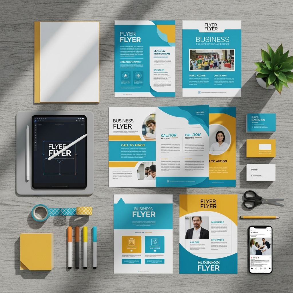
Business flyers remain a cornerstone of affordable, targeted marketing, capable of reaching local audiences with precision. When designed thoughtfully, they cut through the noise, delivering clear messages that prompt immediate action. This guide explores proven techniques to elevate your flyer game, drawing on design principles that prioritize clarity, appeal, and conversion.
Defining Your Flyer’s Core Purpose
Every successful flyer starts with a sharp focus on its objective. Whether promoting a sale, announcing a new service, or inviting event attendance, the content must align tightly with that goal. Begin by asking: What one action do you want readers to take? This singular focus prevents dilution of your message and keeps the design streamlined.
For instance, a restaurant flyer might spotlight a limited-time discount to drive foot traffic, while a service-based business could emphasize problem-solving benefits to generate inquiries. Clarity here sets the foundation for all subsequent decisions on layout, visuals, and wording.
Grabbing Attention with Powerful Headlines
The headline is your flyer’s first impression, demanding to be bold, benefit-driven, and concise. Aim for phrases that evoke curiosity or urgency, such as “Slash Your Energy Bills by 30% Today!” or “Exclusive Offer: 50% Off First Session.” These not only stop scrollers in their tracks but also hint at the value awaiting them.
- Use action verbs to inject energy and imply immediacy.
- Highlight benefits over features—focus on what the customer gains.
- Keep it short: 5-10 words maximum for instant readability.
Test headlines by reading them aloud; if they don’t excite, refine them. Pairing a strong headline with a striking visual amplifies its impact exponentially.
Leveraging Visuals for Instant Impact
Visuals account for up to 90% of the information processed by the brain in the first few seconds. High-quality images, icons, and graphics should reinforce your message without overwhelming the page. Choose photos that evoke emotion or showcase real results—think smiling customers or before-and-after transformations.
Incorporate shapes and colors strategically:
| Element | Purpose | Best Practices |
|---|---|---|
| Bright Shapes | Highlight key info | Limit to 2-3 colors; use for quotes or CTAs |
| Icons | Simplify concepts | Match brand style; ensure scalability |
| Background Images | Add depth | Subtle overlays for text legibility |
Avoid clutter by reserving visuals for emphasis. Complementary color schemes, like blue for trust or red for urgency, guide the eye naturally toward your call-to-action.
Structuring Content for Effortless Scanning
Readers spend mere seconds deciding whether to engage, so structure demands scannability. Divide content into clear sections using boxes, lines, or ample white space. Prioritize a hierarchy: headline first, then subheads, bullet points for benefits, and details last.
- Headline: Grabs attention.
- Subheadline: Expands the hook.
- Bullets: List 3-5 key benefits.
- Details: Who, what, when, where.
Embrace simplicity—fewer words mean higher retention. White space acts as a visual breather, making dense info feel approachable and professional.
Highlighting Benefits to Build Desire
Shift from features to benefits to connect emotionally. Instead of “Our software has AI integration,” say “Automate tasks and save 10 hours weekly.” This customer-centric approach paints a picture of improved lives or solved pains.
Common pitfalls include generic claims; back benefits with specifics where possible, like percentages or testimonials. Phrases like “Transform your workflow” resonate when tied to tangible outcomes.
Integrating Clear Calls-to-Action
A flyer without a CTA is a missed opportunity. Position it prominently, using imperative language: “Call Now for Your Free Quote!” or “Scan to Claim 20% Off.” Include multiple contact points—phone, email, website, QR code—for flexibility.
QR codes shine here, linking directly to landing pages or forms. Always add a brief descriptor, e.g., “Scan for instant booking,” to build confidence even if scanning fails.
Tailoring to Your Target Audience
One-size-fits-all flyers flop. Profile your audience: demographics, pain points, preferences. A flyer for young professionals might use sleek minimalism and tech lingo, while one for families opts for warm tones and relatable scenarios.
Localize content—mention nearby landmarks or community events—to foster relevance. Testing variations with small print runs reveals what resonates most.
Maintaining Brand Consistency
Your flyer is an ambassador of your brand. Adhere to logos, fonts, and colors from your style guide for instant recognition. Consistency builds trust, turning one-off viewers into loyal advocates.
Even solo entrepreneurs benefit from defining a basic palette and typography set, ensuring all materials feel cohesive across channels.
Technical Design Essentials
Beyond creativity, technical precision matters. Use high-resolution images (300 DPI minimum) to avoid pixelation. Fonts should contrast backgrounds—sans-serif for readability at distance.
Balance elements: Rule of thirds for placement, ensuring no section dominates unfairly. Proofread rigorously; errors erode credibility instantly.
Distribution Strategies for Maximum Reach
Design is half the battle—strategic placement completes it. High-traffic spots like community boards, cafes, and counters yield best results. Handouts at events or door-to-door in targeted neighborhoods amplify exposure.
Track effectiveness with unique codes or landing pages. Seasonal timing, like back-to-school flyers in August, aligns with audience needs.
Measuring Success and Iterating
Quantify impact through redemption rates, inquiries, or sales spikes. Tools like QR analytics provide data on scans and conversions. A/B test elements—headlines, colors—to refine future designs.
Success metrics vary: 5-10% response for events is strong; adjust based on industry benchmarks.
Frequently Asked Questions
What makes a flyer effective?
A flyer succeeds by combining eye-catching visuals, concise benefits-focused copy, a strong CTA, and audience relevance, all in a clutter-free layout.
How do I choose colors for my flyer?
Select colors matching your brand and evoking desired emotions—blue for trust, green for growth—while ensuring text contrast for readability.
Should I include prices on flyers?
Yes, for transparency, especially bargains. Position strategically: center for deals, subtle for premium offerings with added value.
What’s the best size for business flyers?
Standard A5 or letter size balances portability and visibility; trim to fit distribution methods.
Can digital flyers replace print?
Print excels for local tangibility; digital suits email/social. Hybrid approaches maximize reach.
Final Pre-Print Checklist
- Headline grabs in 3 seconds?
- Core message crystal clear?
- All essentials (contacts, dates) included?
- CTA prominent and actionable?
- Images crisp, text legible?
- Proofread and brand-aligned?
References
- 50+ Flyer Examples, Ideas and Design Tips [2026] — Venngage. 2026-01-01. https://venngage.com/blog/flyer-examples/
- Flyer Design for Businesses: Tips and Resources — NextDayFlyers. 2023-05-15. https://www.nextdayflyers.com/blog/flyer-design-for-businesses-tips-and-resources/
- Promotional Posters and Flyer Design Considerations — University of Tennessee Institute of Agriculture (.edu). 2020-10-01. https://utia.tennessee.edu/cpa/wp-content/uploads/sites/106/2020/10/cpa180.pdf
- The ultimate guide to create your own flyer design — Canva. 2024-02-20. https://www.canva.com/learn/the-ultimate-guide-to-flyer-design/

Medha Deb is an editor with a master's degree in Applied Linguistics from the University of Hyderabad. She believes that her qualification has helped her develop a deep understanding of language and its application in various contexts. Medha specializes in the areas of beauty, health, sports, and wellness and is committed to ensuring that the content on the website is…