
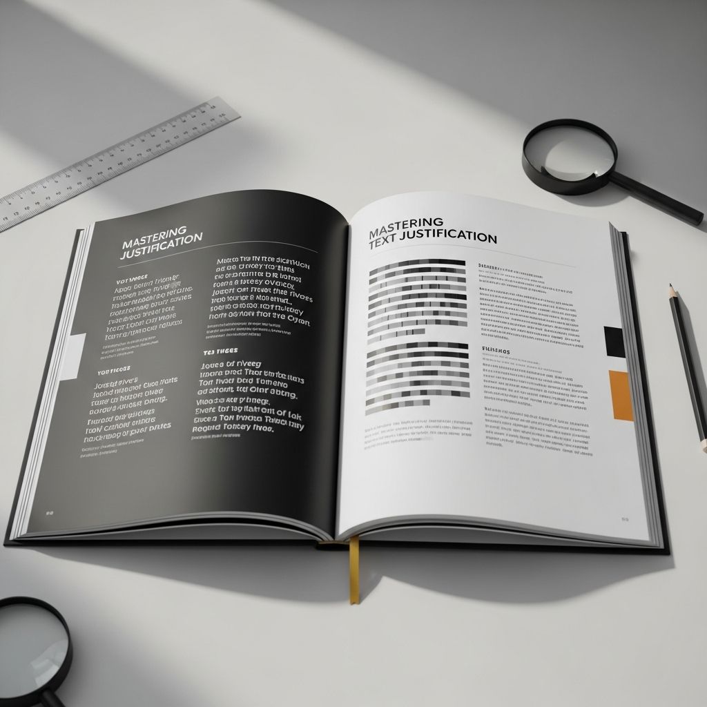
Text justification remains a cornerstone of professional typography, ensuring that lines of text align neatly with both left and right margins for a polished appearance. This technique, prevalent in print media for centuries, adjusts spacing between words, letters, or glyphs to create uniform edges, enhancing visual harmony while influencing readability.
Core Principles of Typographic Alignment
Alignment in typography refers to how text blocks are positioned relative to margins. The four primary types include left-aligned (ragged right), right-aligned (ragged left), centered, and fully justified. Fully justified text stretches content to fit precisely between margins, a method historically favored in Western printing traditions since the advent of movable type.
Left alignment keeps text flush left with a ragged right edge, promoting natural reading flow without spacing distortions. Centered alignment suits headings or short blocks, distributing space evenly. Right alignment, less common in left-to-right scripts, mirrors left alignment for right-to-left languages. Full justification, however, demands careful space management to avoid irregularities.
- Left-aligned: Consistent word spacing, ideal for readability in narrow columns.
- Right-aligned: Useful for right-to-left scripts like Arabic or Hebrew.
- Centered: Balances text symmetrically, perfect for titles.
- Justified: Creates clean block edges but risks uneven spacing if mishandled.
Historical Evolution of Justification Practices
Justification traces back to classical manuscripts where scribes approximated even margins manually. The invention of movable type by Johannes Gutenberg in the 15th century standardized it, making justified columns the norm in books and newspapers. This persisted due to the aesthetic appeal of straight-edged pages, mimicking high-end codices.
Early compositors flexed word spaces—expanding for ‘loose lines’ or compressing for ‘tight lines’—to fill measures. Modern software automates this, incorporating hyphenation to break words and reduce excessive gaps. Today, digital tools like Adobe InDesign offer granular controls, evolving from manual hot-metal typesetting.
Technical Mechanisms Behind Justification
Justification algorithms adjust inter-word and inter-letter spacing to meet margin constraints. In left-to-right languages, the process optimizes character counts per line, prioritizing word spaces before letter spaces. Hyphenation prevents over-stretching by allowing syllable breaks at line ends.
The last line of a justified paragraph typically avoids full stretch, opting for left or right alignment to prevent awkward whitespace. Forced justification, conversely, applies uniform treatment, sometimes at readability’s expense. Tools weigh factors like typographic color—visual evenness—and legibility during computation.
| Adjustment Type | Description | Pros | Cons |
|---|---|---|---|
| Word Spacing | Primary expansion/compression between words | Maintains letter integrity | Rivers of space in poor layouts |
| Letter Spacing | Tracking: subtle kerning adjustments | Fills tight spots finely | Can distort word shapes if excessive |
| Hyphenation | Word breaking at syllables | Reduces gaps significantly | Increases hyphen density |
| Glyph Distortion | Script-specific elongation (e.g., Arabic) | Preserves cultural style | Requires advanced engines |
Justification Across Writing Systems
Typographic conventions vary by script. In English and similar languages, inter-word spacing dominates, supplemented by hyphenation. European languages follow suit, balancing aesthetics with flow.
East Asian scripts like Chinese lack word spaces, relying on inter-character spacing, punctuation adjustments, and script boundaries. Japanese and Korean may insert thin spaces or scale glyphs subtly. Cursive systems such as Arabic permit kashida—elongating connections between letters—alongside word spacing, maintaining calligraphic flow without compromising readability.
For bidirectional text (e.g., English quotes in Arabic), engines must handle directionality, ensuring justification respects primary script rules. Layout engines like HarfBuzz or ICU implement these nuances, adapting to user locale.
Advantages and Drawbacks of Justified Text
Justified layouts offer a formal, compact look, saving space in books and optimizing page real estate. The clean margins create a rhythmic ‘river’ of white space down the page, guiding the eye efficiently. Professionally typeset justification enhances perceived quality, aligning with reader expectations in novels and academic texts.
However, pitfalls abound. Excessive word spacing forms ‘rivers’—vertical gaps disrupting focus. In narrow columns, tiny spaces cram lines, hindering scannability. Without hyphenation, lines become unsightly. Small type sizes exacerbate issues, as adjustments become microscopically uneven.
- Visual Benefits: Uniform blocks, space efficiency.
- Readability Risks: Rivers, uneven rhythm, accessibility barriers for dyslexic readers.
Best Practices for Effective Justification
Success hinges on column width: aim for 45-75 characters per line for optimal legibility. Enable hyphenation with limits (no more than two consecutive hyphens). Tweak justification settings: set word spacing min/max (e.g., 80-150%), letter spacing (-2% to +5%).
In Adobe InDesign, access Type > Paragraph > Justification for controls. Microsoft Word offers basic alignment buttons, but advanced users prefer dedicated software. Test at intended size and medium—print tolerates more variation than screens.
For web, CSS text-align: justify; works, but pair with hyphens: auto; and font-specific tweaks. Avoid justification in mobile views; default to left-aligned for fluidity.
Tools and Software for Modern Typesetters
Contemporary workflows leverage powerful applications. InDesign excels with composer engines prioritizing optical margins. LaTeX automates high-quality justification via TeX algorithms, ideal for technical documents. Web developers use CSS properties like text-justify (e.g., inter-word, distribute).
Fonts matter: OpenType features like ‘calt’ (contextual alternates) aid cursive justification. Validate outputs with tools like Typometal or preflight checks.
Frequently Asked Questions (FAQs)
What is the difference between alignment and justification?
Alignment positions text relative to one margin (left, right, center), while justification aligns to both by adjusting internal spacing.
Is justified text always better for books?
No; it suits wide measures but ragged-right enhances readability in narrow formats or sans-serif fonts.
How does justification work in non-Latin scripts?
It adapts: inter-character for CJK, elongation for Arabic, prioritizing script conventions.
Should I use justification on the web?
Selectively—fine for desktops, but left-align for mobile to avoid reflow issues.
What causes ‘rivers’ in justified text?
Coincidental large word spaces aligning vertically; mitigate with better hyphenation and spacing limits.
Future Trends in Typographic Justification
AI-driven engines promise smarter adjustments, predicting optimal spacing via machine learning on vast corpora. Variable fonts enable dynamic scaling mid-line. Accessibility standards push hybrid approaches, blending justification with user preferences (e.g., via CSS media queries).
Responsive design demands fluid justification, adapting to viewport sizes. As reflowable e-books dominate, algorithms will refine last-line handling and cross-script harmony.
References
- Text justification – Globalization — Microsoft. 2023-10-12. https://learn.microsoft.com/en-us/globalization/fonts-layout/text-justification
- Approaches to full justification — W3C. 2022-05-18. https://www.w3.org/International/articles/typography/justification.en.html
- Typographic alignment — Wikipedia (informed by primary sources). 2024-01-15. https://en.wikipedia.org/wiki/Typographic_alignment
- Chicago Manual of Style FAQ #41 — University of Chicago Press. 2023-08-07. https://www.chicagomanualofstyle.org/qanda/data/faq/topics/ManuscriptPreparation/faq0041.html
- Justified Text Versus Ragged-Right Text — Adams on Contract Drafting. 2022-11-20. https://www.adamsdrafting.com/justified-text-versus-ragged-right-text/

- Integrated M.A. in Applied Linguistics, University of Hyderabad
- 5+ years in editorial, instructional, SEO, and research-based writing
Sneha is a relationships and lifestyle writer with a strong foundation in applied linguistics and certified training in relationship coaching. She brings over five years of writing experience to theskillvault, crafting thoughtful, research-driven content that empowers readers to build healthier relationships, boost emotional well-being, and embrace holistic living. Her writing and insights reflect the belief that beauty, happiness, and wellness…